Report to the Board Q4 2009
Financial Trends 2008 and 2009
Income and Expenses Overview
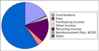
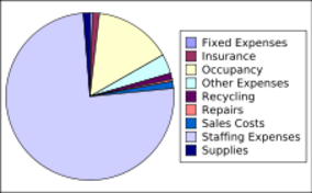
These income and expense pie charts help to understand where the money comes from and goes in general. The data is based on actuals for the 2009. (A few numbers relating to recycling expenses and recycling income for the month of December are estimates, and may change slightly in the near future.) A number of income and expense items changed between 2008 and 2009, so 2008 numbers are not included in the above overview.
Income and Expenses History
Quarterly
| Q1 2008 | Q2 2008 | Q3 2008 | Q4 2008 | Q1 2009 | Q2 2009 | Q3 2009 | Q4 2009 | |
| Income | $229,744.99 | $217,708.27 | $218,767.35 | $187,418.39 | $205,752.82 | $233,876.62 | $262,149.86 | $281,813.02 |
| Expenses | $192,906.49 | $197,644.73 | $207,570.77 | $211,437.01 | $187,025.35 | $197,683.52 | $209,334.00 | $219,874.84 |
| Net | $ 36,838.50 | $ 20,063.54 | $ 11,196.58 | $ (24,018.62) | $ 18,727.47 | $ 36,193.10 | $ 52,815.86 | $ 61,938.18 |
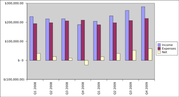
Net is income minus expenses. Q4 of 2008 is the only quarter with a net loss $(24,018.62). Easier to grok as a bar graph:
The above table shows and chart shows the years 2008 and 2009, quarter by quarter, with income and expenses compared. Except for Q4 2008 income exceeded expenses and the net income has been growing since. The problem with Q4 were severalfold, including a snow storm that shut us down for much of December, the collapse of the commodities market which cut into recycling income, and the general financial meltdown which diminished monetary contributions.
Monthly
The above chart shows Free Geek's Income, month by month, over the period of 2008 and 2009. This chart excludes one time income since its purpose is to show the overall trends. You can see that the largest income stream is Sales with Donations and Recycling coming in about tied for second place. You can see the change in some of the smaller income streams from 2008 to 2009. Close examination shows a spike in fundraising income at the end of each year.
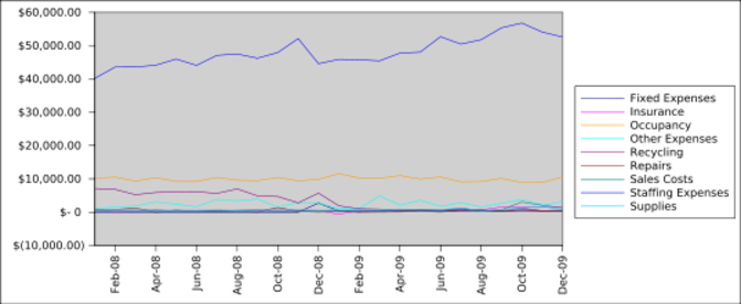
The above chart shows Free Geek's Expenses, month by month, over the period of 2008 and 2009. This chart excludes one time expenses since its purpose is to show the overall trends. You can see that Staffing expenses are the largest expense by far. Occupancy expenses are next, about a quarter of staffing. You can see the recycling expenses drop as a result of the new legislation that went into effect at the beginning of 2009.
Sales Breakdown
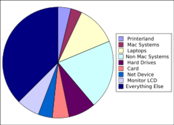
Free Geek's sales are spread across several types of gizmos. If an gizmo type represented 3-4% of total sales it is represented as a slice of pie above. All the small types (under 3% individually) add up to the largest slice (37%). Not surprisingly regular systems account for the biggest chunk, though they are dropping off over time as more people purchase laptops.
Mission Related Information
Systems Disbursed
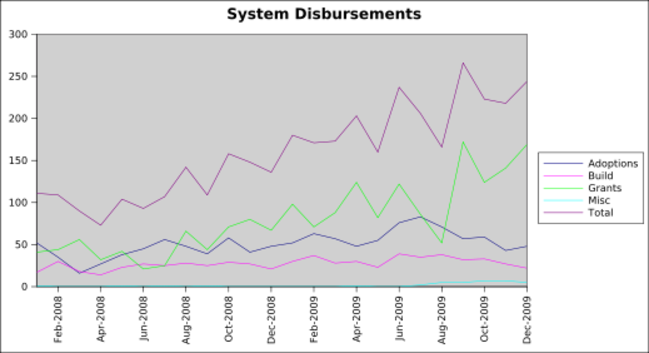
In 2009 Free Geek disbursed 1,086 computers to volunteers and 1,329 to nonprofit organizations. These numbers are up from 2008 when we sent 787 computers home with volunteers, and gave 589 to nonprofit organizations.
Volunteer Hours Logged
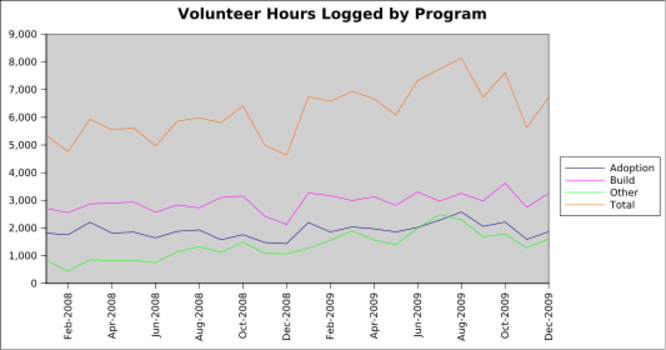
In 2009 volunteers logged 82,910 hours of time. This is up from 65,865 in 2008.
Classes Offered
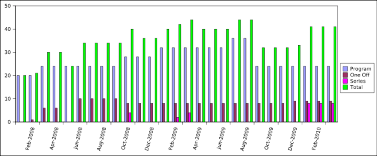
In 2009 we offered 463 educational classes. This is up from 373 in 2008.
Reuse vs. Recycling
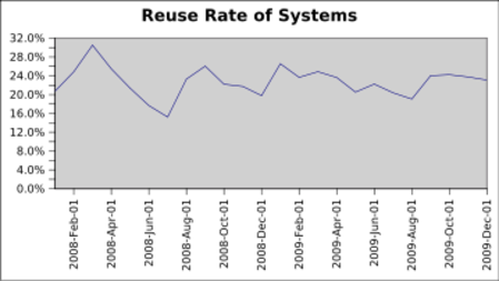
In 2009 23% of the computers we received were reused rather than recycled. This is up slightly from 2008.
