Mission Trends 2009
Hours
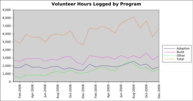
Review which jobs are flagged in the database as Build or Adoption or neither. Pull the year, month, and number of hours logged in each of the three categories, grouping by year, month, and category. Then make charts that show the trends for each.
The above chart shows how many hours were logged in each program by month.
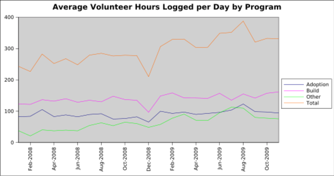
The above chart shows how many average hours were logged in each program by day for each month. We are counting business days only and excluding holidays. Look at any of the lines around November (our shortest month) and compare it to the earlier graph. You can see how averaging by day smooths out the lines a bit.
Disbursements
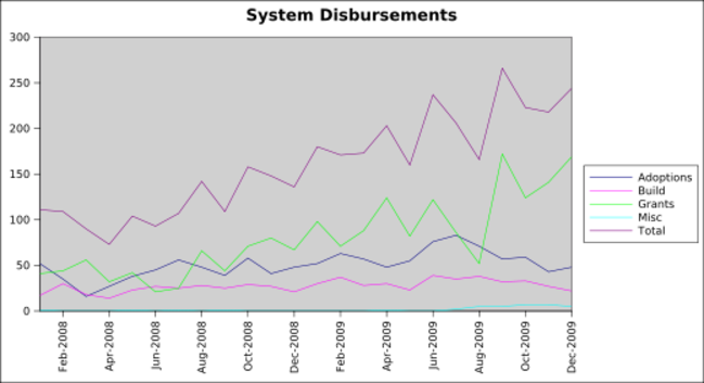
These graphs should show regular systems, mac systems, and laptops combined and broken out by month. This can be determined by using the gizmo report (month by month) and adding the numbers together. Sophia already did this for grants. If I can extract from the database more easily, I can check my results against her numbers.
General upward trend over time.
What happened in July and September of 2009 for such an uncharacteristic low and then high? Did everything get recorded on time? Was someone on vacation?
Classes
I'll need Laurel's help on this.


