Financial Trends 2009
This is for showing financial trends in 2008 and 2009. I'll put graphs and explanations here.
Overview
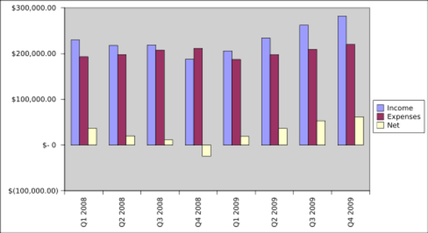
| Q1 2008 | Q2 2008 | Q3 2008 | Q4 2008 | Q1 2009 | Q2 2009 | Q3 2009 | Q4 2009 | |
| Income | $229,744.99 | $217,708.27 | $218,767.35 | $187,418.39 | $205,752.82 | $233,876.62 | $262,149.86 | $281,813.02 |
| Expenses | $192,906.49 | $197,644.73 | $207,570.77 | $211,437.01 | $187,025.35 | $197,683.52 | $209,334.00 | $219,874.84 |
| Net | $ 36,838.50 | $ 20,063.54 | $ 11,196.58 | $ (24,018.62) | $ 18,727.47 | $ 36,193.10 | $ 52,815.86 | $ 61,938.18 |
The above table shows and chart shows the years 2008 and 2009, quarter by quarter, with income and expenses compared. Except for Q4 2008 income exceeded expenses and the net income has been growing since. The problem with Q4 were severalfold, including a snow storm that shut us down for much of December, the collapse of the commodities market which cut into recycling income, and the general financial meltdown which diminished monetary contributions.
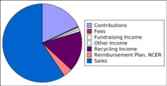
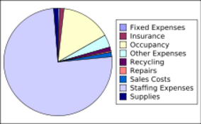
These income and expense pie charts help to understand where the money comes from and goes in general. The data is based on monthly averages for the 2008-2009 years (so far).
The above chart shows Free Geek's Income, month by month, over the period of 2008 and 2009 (so far). This chart excludes one time income since its purpose is to show the overall trends. You can see that the largest income stream is Sales with Donations and Recycling coming in about tied for second place.
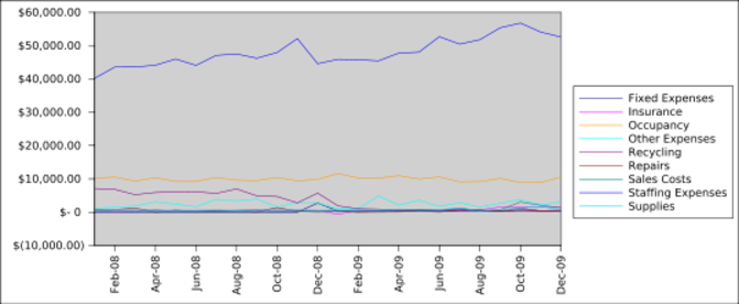
The above chart shows Free Geek's Income, month by month, over the period of 2008 and 2009 (so far). This chart excludes one time expenses since its purpose is to show the overall trends. You can see that Staffing expenses are the largest expense by far. Occupancy expenses are next, about a quarter of staffing.
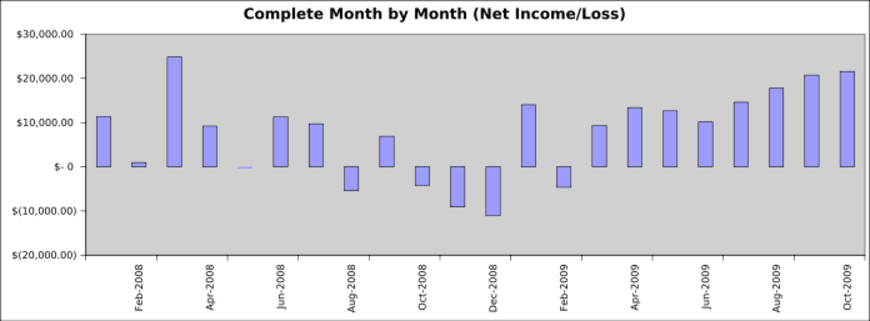
This shows the results of subtracting expenses from income, that is the net income (or loss). This chart excludes one time income and expenses since its purpose is to show the overall trends.
Same chart, but this one includes one time income and expenses. You may note that net income is positive in the same months, regardless of the one time income and expenses.
Major Expense Streams
Staffing
This is our biggest expense. This covers payroll and all benefits and associated costs.
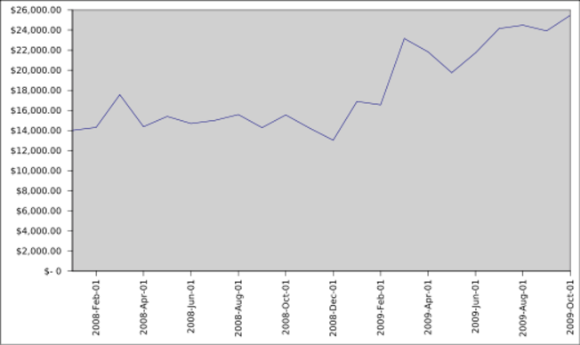
In 2008 and 2009 most of the slow increase reflects gradually more hours being paid for. In November there was a bonus given out (explains the peak for that month). In December 2008 most of the hourly workers went unpaid due to unexpected snow closures.
Starting September 2009, Staff Collective went from 37 to 40 paid hours per week, explaining the most recent upward slope.
Occupancy
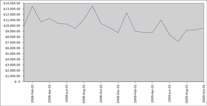
This is our second biggest expense. This covers rent and utilities and associated costs.
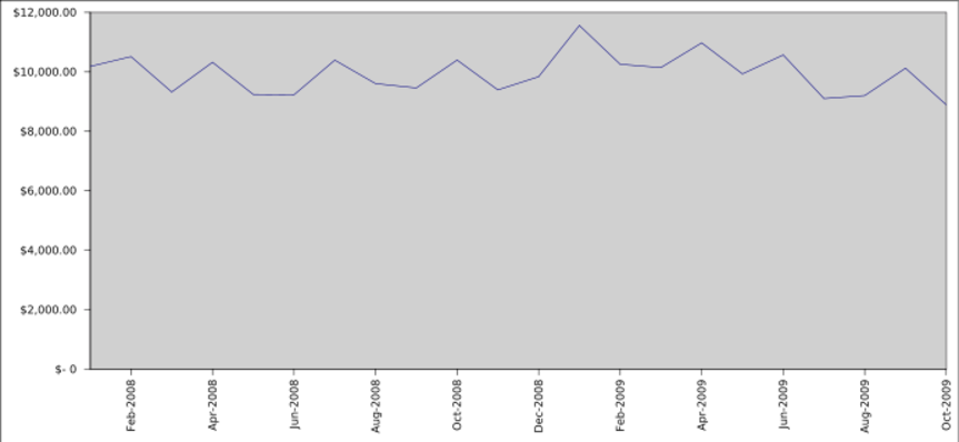
Rent and most utilities are paid monthly. Water and sewage is paid quarterly, explaining the quarterly spikes. Heating in the winter and cooling in the summer mostly cancel each other out. Starting in July 2009, we got a property tax exemption which reduced our rent.
Major Income Streams
Front Desk
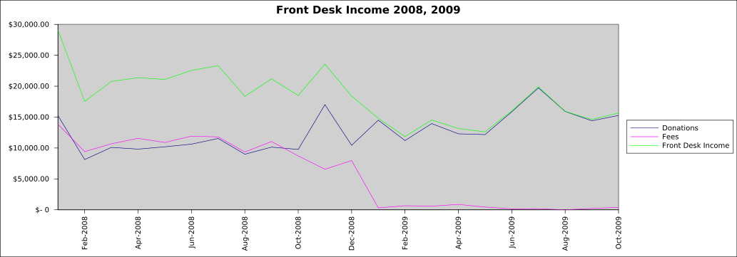
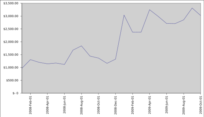
Here are the income streams related to the Front Desk. You can see that mandatory Fees dropped dramatically at the beginning of 2009 (due to the e-waste legislation).
What explains that bump in July 2009?
Recycling
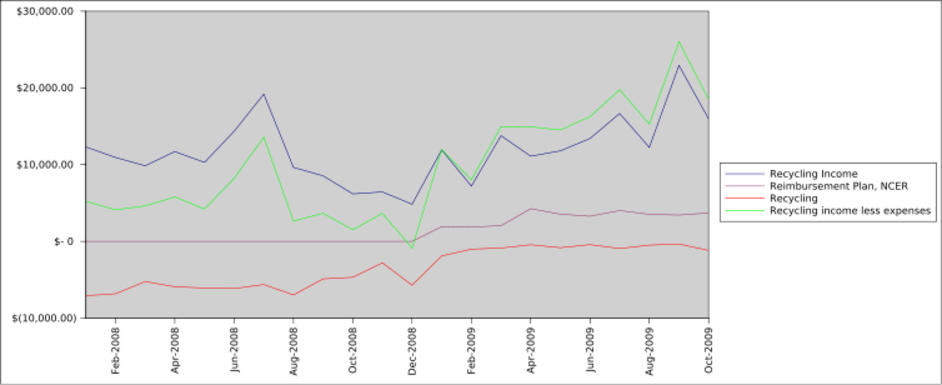
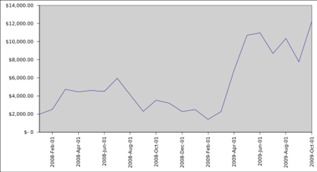
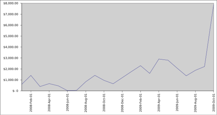
This shows the basic recycling income stream, plus the reimbursements from NCER (which started at the beginning of 2009 along with the e-waste legislation.
NCER reimbursements didn't exist in 2008, so the purple line is flat at zero for that year. Then it starts to take off.
Also included is the related Recycling Expense (red line). Note that it was much larger in 2008 (before the legislation) compared to 2009 (after). It is shown here as a negative number, so the closer to zero the better.
You can see the commodities bubble in July 2008 as well as its crash and the snowstorm in the third quarter of 2008. But you can also see that it's over. In September 2009 we received 4 gaylords of circuit boards which helps explain the peak point on the chart.
Sales
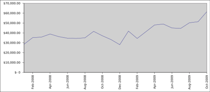
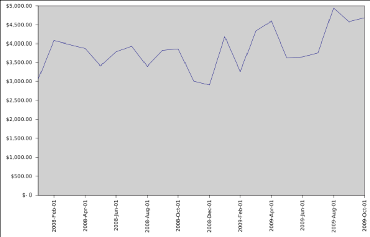
Sales is the biggest income stream for Free Geek. You can see the effect of the December 2008 weather which closed Free Geek for much of the month. Also, short months such as November and February show slight dips. The overall trend is upward, though.
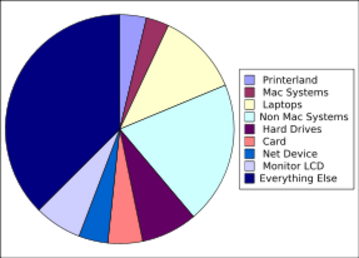
The following charts show trends based on various gizmo types and categories. Please note that the sales numbers below are different that the sales numbers used above. This is due to a quirk in our database code. The database reports that produce the below reports show sales based on total retail price -- that is the amount the item sold for as if coupons and discounts were real money. The above sales chart shows the actual amount of money charged for the items (a lower number). However, it appears that the trends are similar between the two ways of counting the money.
Breaking down sales income:
- Regular systems (non-Mac) make up about 21% of the sales.
- Laptops (including some of the Mac Laptop sales) make up about 11%.
- Hard Drives 8%
- LCD Monitors 7%
- Cards 5%
- Stuff from printerland 4%
- Net Devices 4%
- Mac Systems (including some Mac laptops) 3%
- Everything else that can be easily tracked is 3% or less, combined to 37%.
Systems
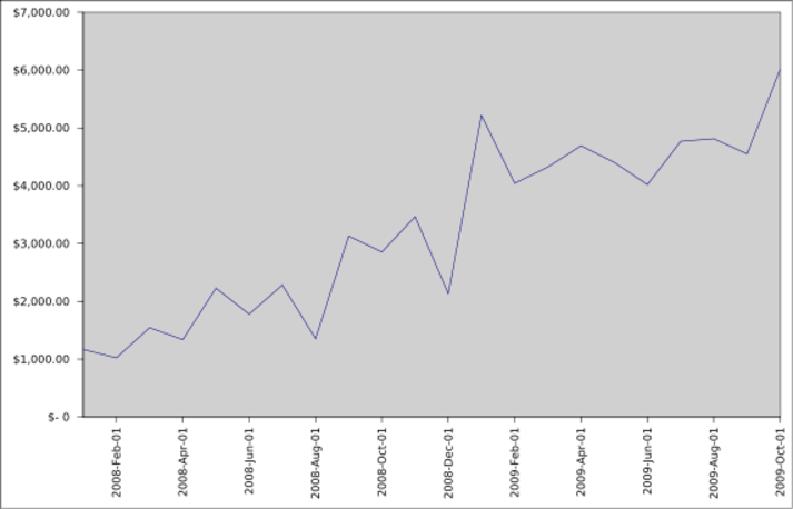
Systems seem to be on a bumpy slope downwards, probably due mostly to increased laptop and mac sales.
Laptops
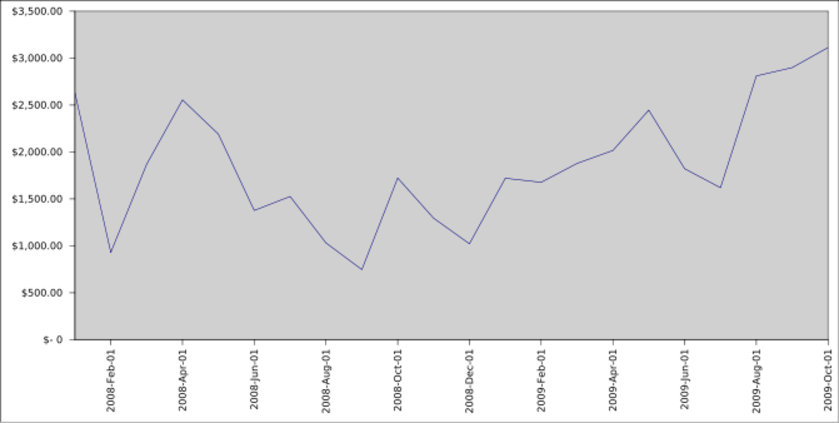
Jeff started winding down in his role as coordinator of laptops in August 2008 and left completely in Nov of 2008. We tried out a different coordinator in the area for a few months. We became unsatisfied with the results and then Dave and Ali took over leadership roles in the area in April of 2009.
Starting in Spring of 2009 there were more laptop classes set up. You can see Dave and Ali's vacations reflected in the bottom points of the "W" shape in July and September.
Hard Drives
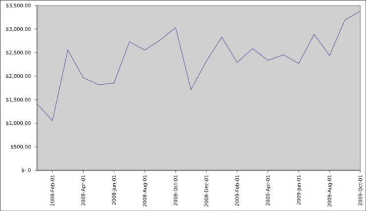
In 2009 hard drive scarcity started to ease up quite a bit. Historically HDs had been a limiting factor as to what could be built and sold. Due to increased quality and quantity of donations we now have many more hard drives that can be both built into systems and sold on their own in the store.
The dip in December 2008 could be related to the snow storm.
LCD Monitors
Growth, obviously. Any comments?
It would be good to compare this with incoming numbers.
Cards
Comments?
Printerland
Kind of bumpy. When were which staff in charge? What did they do? When was Printerland more or less organized (and more or less disorganized)?
Network Devices
The jump in January 2009 that can be seen in the upward trend correlates with improvements that were made to the network testing procedures in advanced testing.
Macintoshes
There is obviously a spike in October. Why?
There was a conscious decision to focus on higher end stuff, increase the number of Mac classes, and get volunteer interns involved in the process. When did this happen?
Miscellaneous
2008 seems pretty flat compared to 2009. Was there anything happening (in the store as opposed to improved production flow) to explain that?
Volunteer interns started to take hold in the first and second quarter of 2009.
When did we start putting more paid sales hours on the schedule?
