Computer Use Survey
Here are the results from the the Computer User Survey.
Data Analysis
Here is some data analysis I did (Explanation Below):

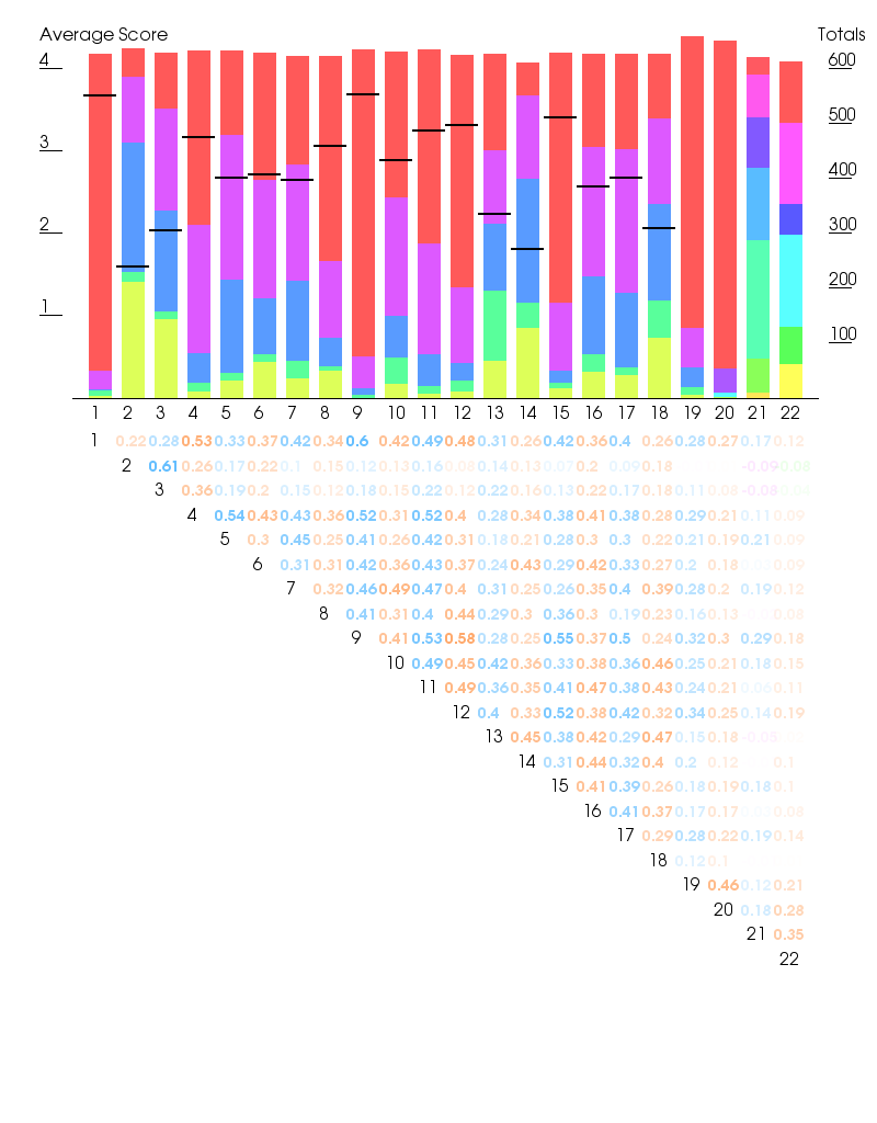
This looks at the Computer Use questions (see chart below to convert numbers into questions). The data was anonymized and answers were first converted into numbers so Not Interested = 0 Want to Learn =1*, Not Very Important = 2 Important =3 Very Important = 4, and then added up.
(*This was a bit of a kludge: I treated it as having a little bit of interest but enough to have actually learned how to do it).
The results from this are shown in the top graph. This shows two different axis of information.
The left had scale and the black bars show the average score for each question showing the relative importance (the exact numbers don't matter as much as how they compare to each other). It doesn't extend all the way across because mean averages , referring to age etc, didn't make much sense (though I do have the calculation). The Mode (commonest) average is easy to see.
The right hand scale shows total answers. The coloured bars are totals for each answer (Not interested (yellow) is at the bottom, Very important (red) at the top.
The bottom chart shows the [Pearson Product Moment Correlation Coefficients for the different questions. This is basically show if there is a significant linear relationship between the two. We can use this to get some idea if peoples answers are related e.g. people who like a also like b (very roughly speaking). The higher the number the more significant the correlation. I have tied the colour to the score so the score fade out as they get less significant.
Caveat:I know very little about statistics. The math is good but there but there is a high chance I abusing it. I did my best to use the correct method to determine correlation for values of best that involve typing stuff in a search engine and trying to make sense of the pages that come up. However I did subsequently find a copy of Kenneth Bailey ,Methods of Social Research', New York, 1994 in the free pile and it says Pearson Product Moment Correlation Coefficient is what is commonly used to measure correlation (which is what I was trying to measure) so hey!
| 1 | "Internet access" |
| 2 | "Playing games on the InternetOnline flash games such as Bejeweled and Facebook games like Farmville. This doesn't include games such as World of Warcraft that you have to install a special piece of software to play. " |
| 3 | "Playing games on your computerGames you play on your computer e.g. Solitaire The Sims or World of Warcraft." |
| 4 | "Watching videos online. e.g. Youtube Vimeo etc." |
| 5 | "Watching DVDs" |
| 6 | "Social networking. e.g. Facebook Twitter etc." |
| 7 | "Burning or creating CDs" |
| 8 | "Applying for jobs" |
| 9 | "Email" |
| 10 | "Digital photography including editing photos and making art on a computer" |
| 11 | "Playing music" |
| 12 | "Work. e.g using an office program such as a word processor or spreadsheets." |
| 13 | "Programming or web design" |
| 14 | "Blogging" |
| 15 | "Homework or online research" |
| 16 | "Skype webcams instant messaging etc." |
| 17 | "Online shopping" |
| 18 | "Video or music production" |
| 19 | "How long have you been using computers?" (Never(0 on scale),<1 year, 1-5 years, 5-10 years, >10 years) |
| 20 | "How often do you use a computer?" (Never(0 on scale), A few times a month,A few times a week, Daily) |
| 21 | "How old are you?" (>12 (0 on scale) 13-19, 20-34, 35-44, 45-54, 55-64, 65+) |
| 22 | "What is the highest level of education you have completed?" (Less than High School(0 on scale), Graduated High School (or equivalent), Some College, Two Year Degree, Two Year Degree, Post Graduate Studies) |